|
We delved into Art History to inquire into Pop Art as a modern firm of visual expression. We looked at works of prominent artists like Andy Wharhol, Roy Litchenstien and Kieth Harris and discussed their distinctive styles. Our lines of inquiry are: - The relationship between colour schemes in Pop Art(Function) - How Pop Art was influenced by iconic images and consumerism (Causation) - Intensity affects the appearance of colour(Connection). 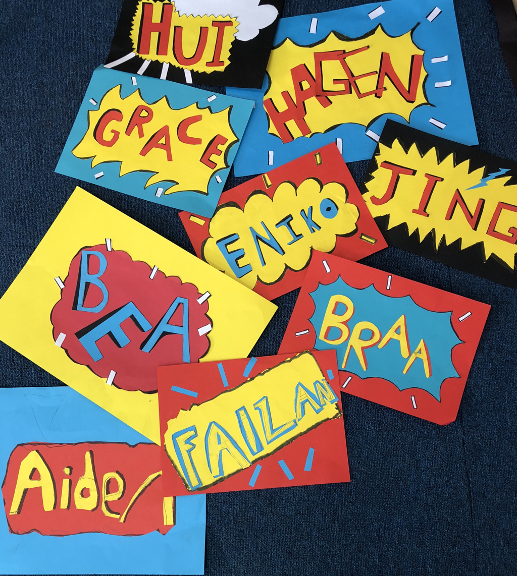 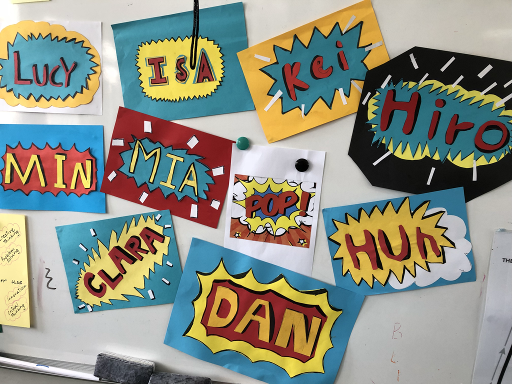 Experiments with bold and flat primary colours
0 Comments
|
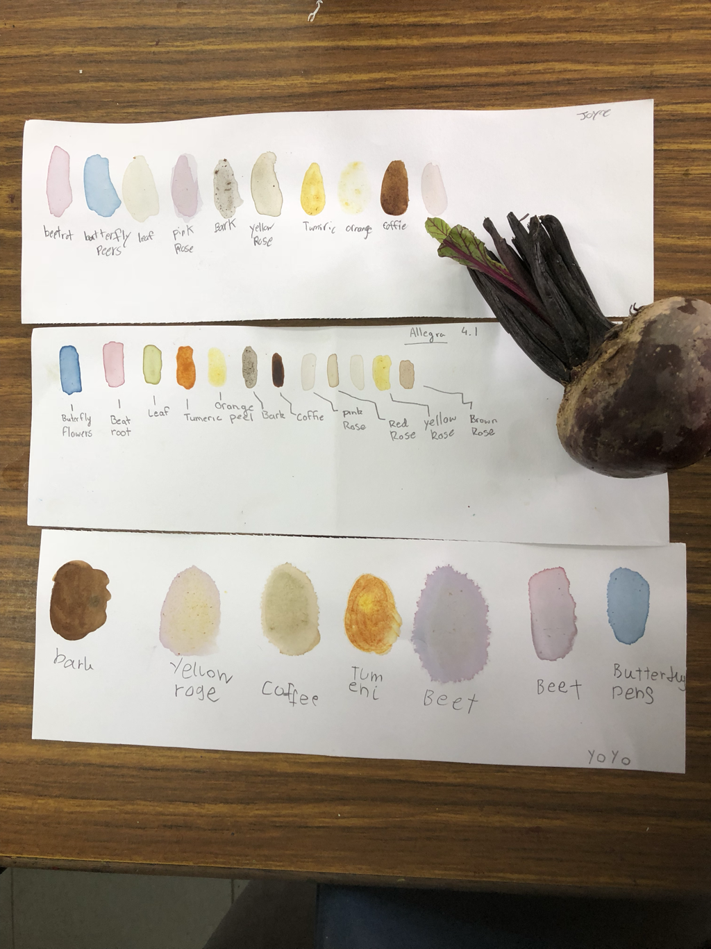
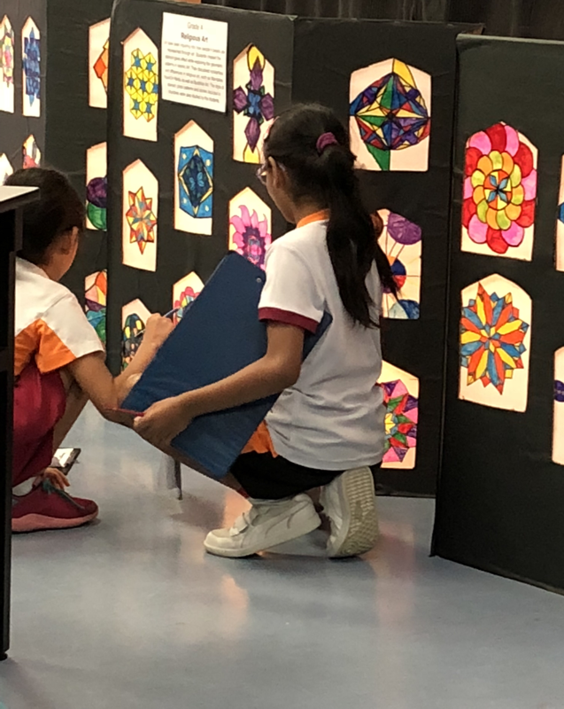
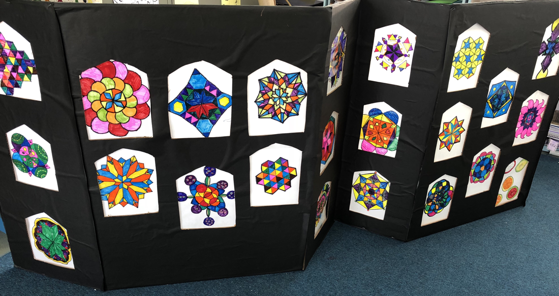
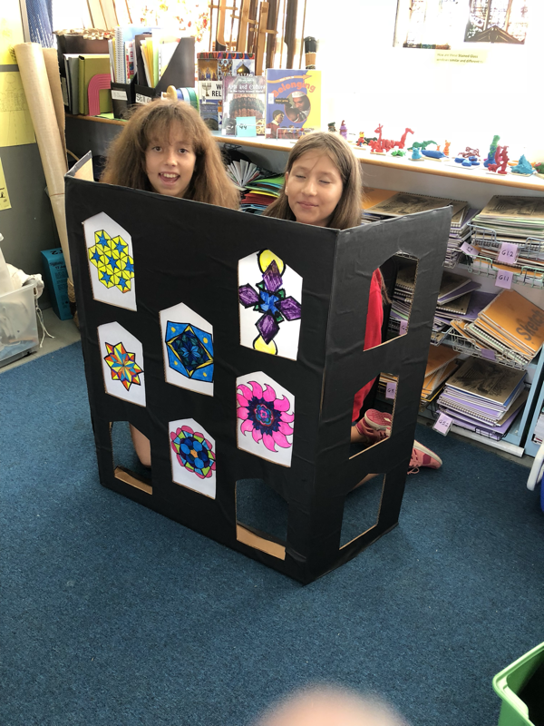
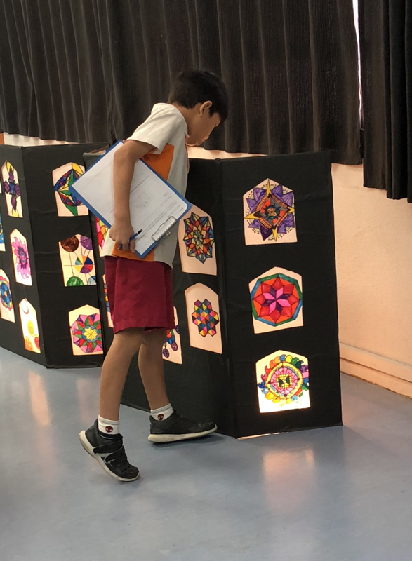
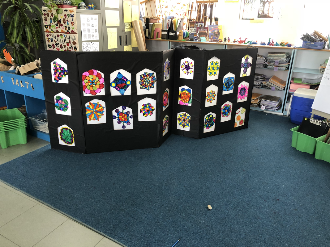
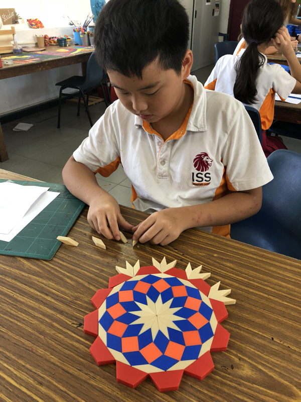
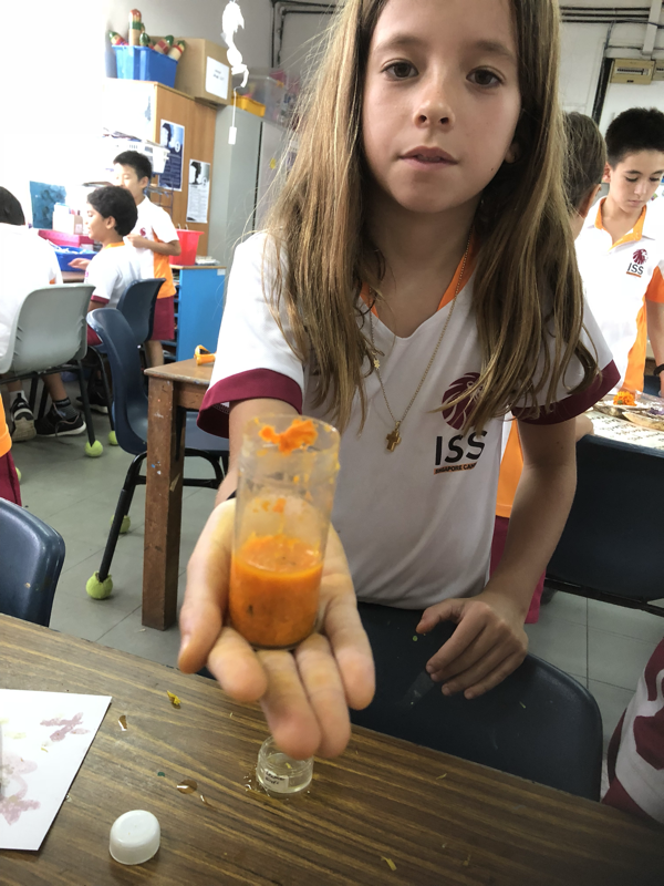
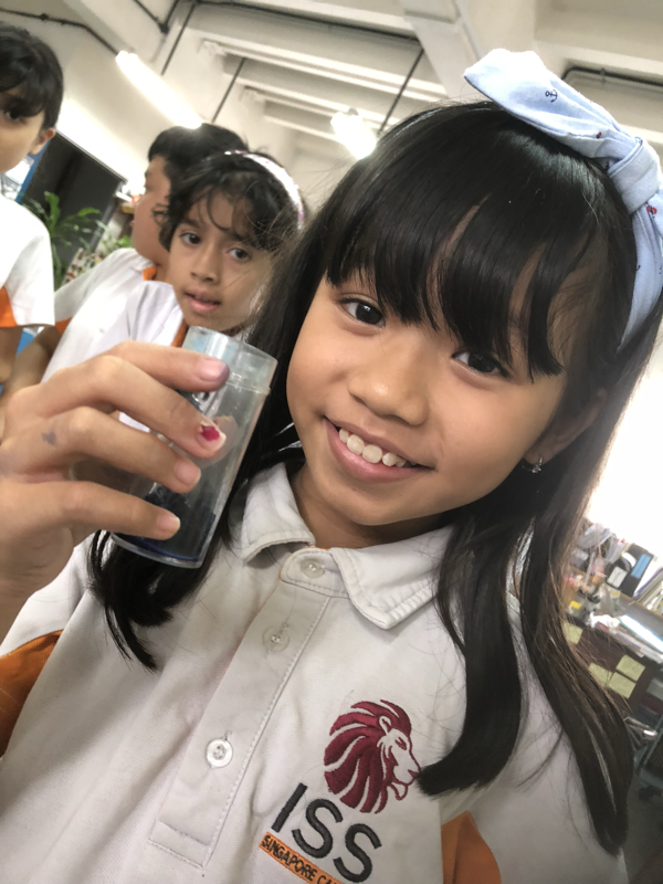
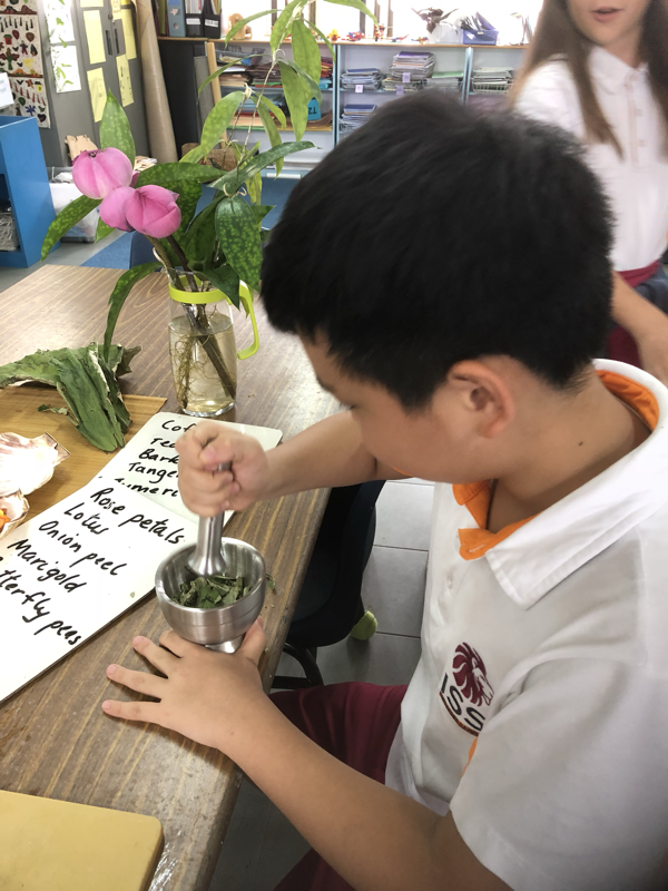
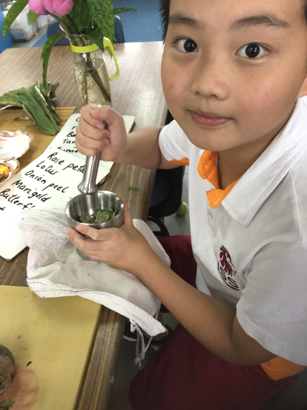
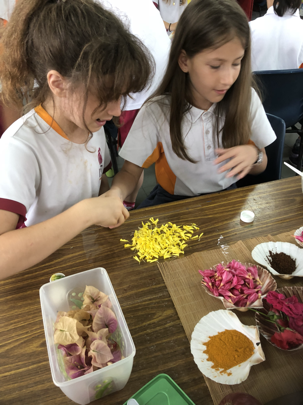
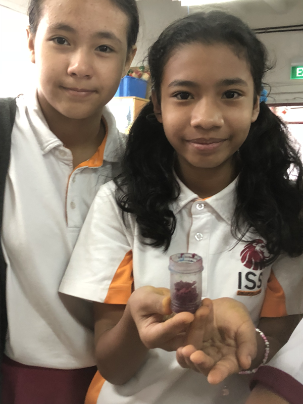
Religious Art: Geometric PatternsThe Natural WorldGrade 4 explored vegetable dyes.
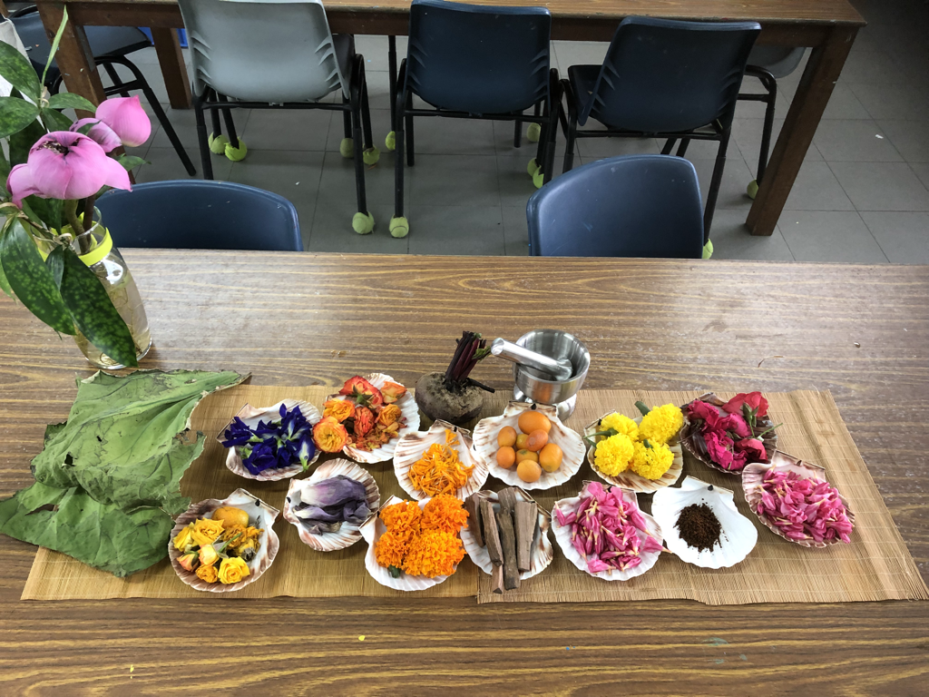
Extracting pigments from butterfly peas flowers, Marigold, roses and other flowers. We.also ground coffee and bark to make the colour brown. The hardest was extracting green as it would turn brown almost as soon as we made it. Butterfly peas, beetroot , turmeric and coffee gave us the best results to use in our art work. Since blue, yellow and red are primary colours, we could make secondary colours by mixing them.
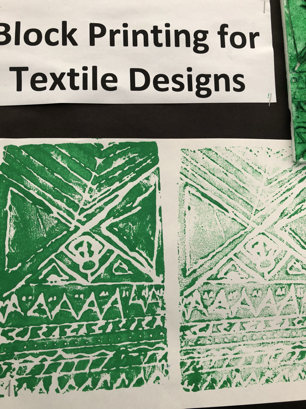
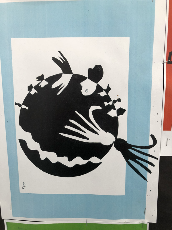
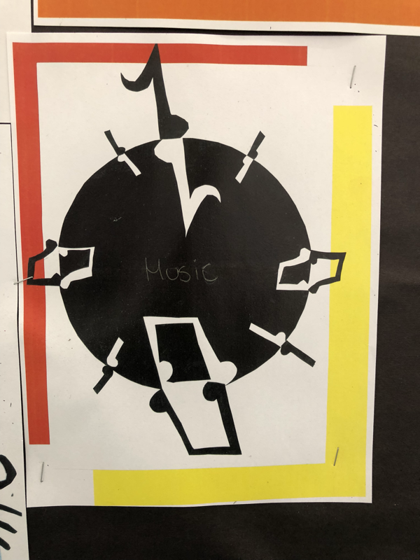
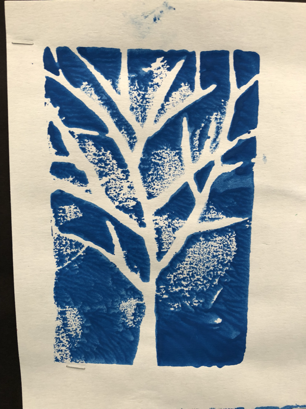
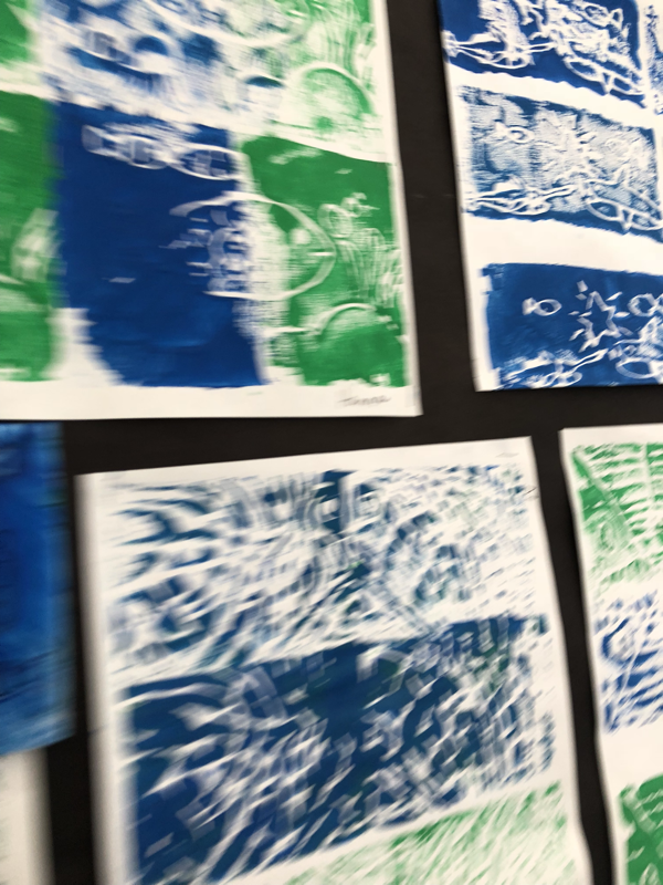
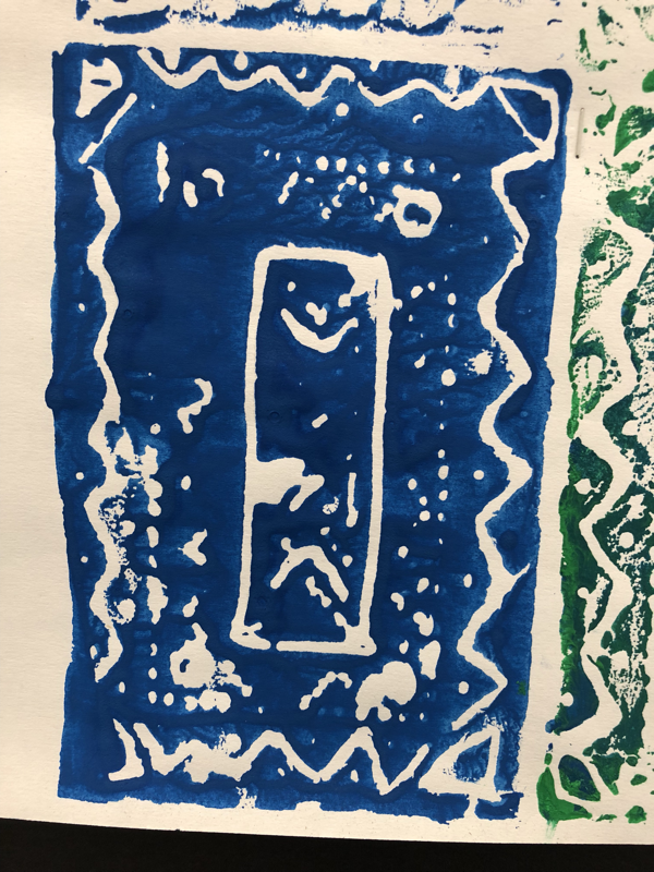
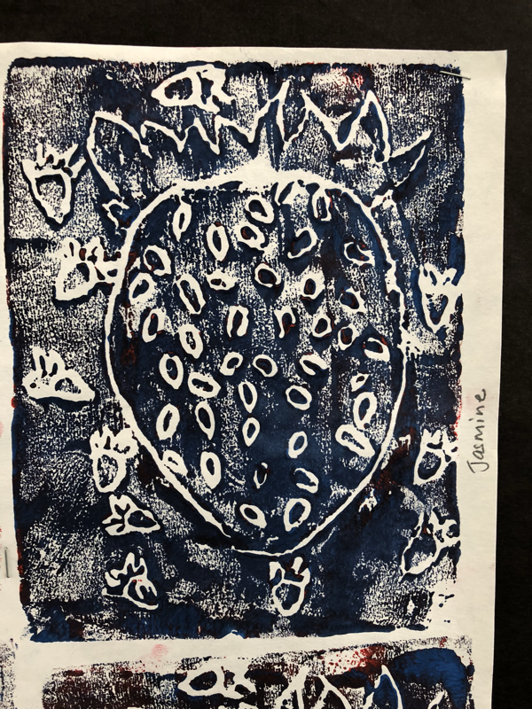
Positive and negative spaces: Block printing and Japanese NotanAuthorWrite something about yourself. No need to be fancy, just an overview. ArchivesCategories |
 RSS Feed
